
The branding reflects the stillness of the harvest through a clean and intentional aesthetic. By merging organic lines with minimalist geometry, the visual identity speaks of origin, precision, and the silent beauty found within the life cycle of a single seed.
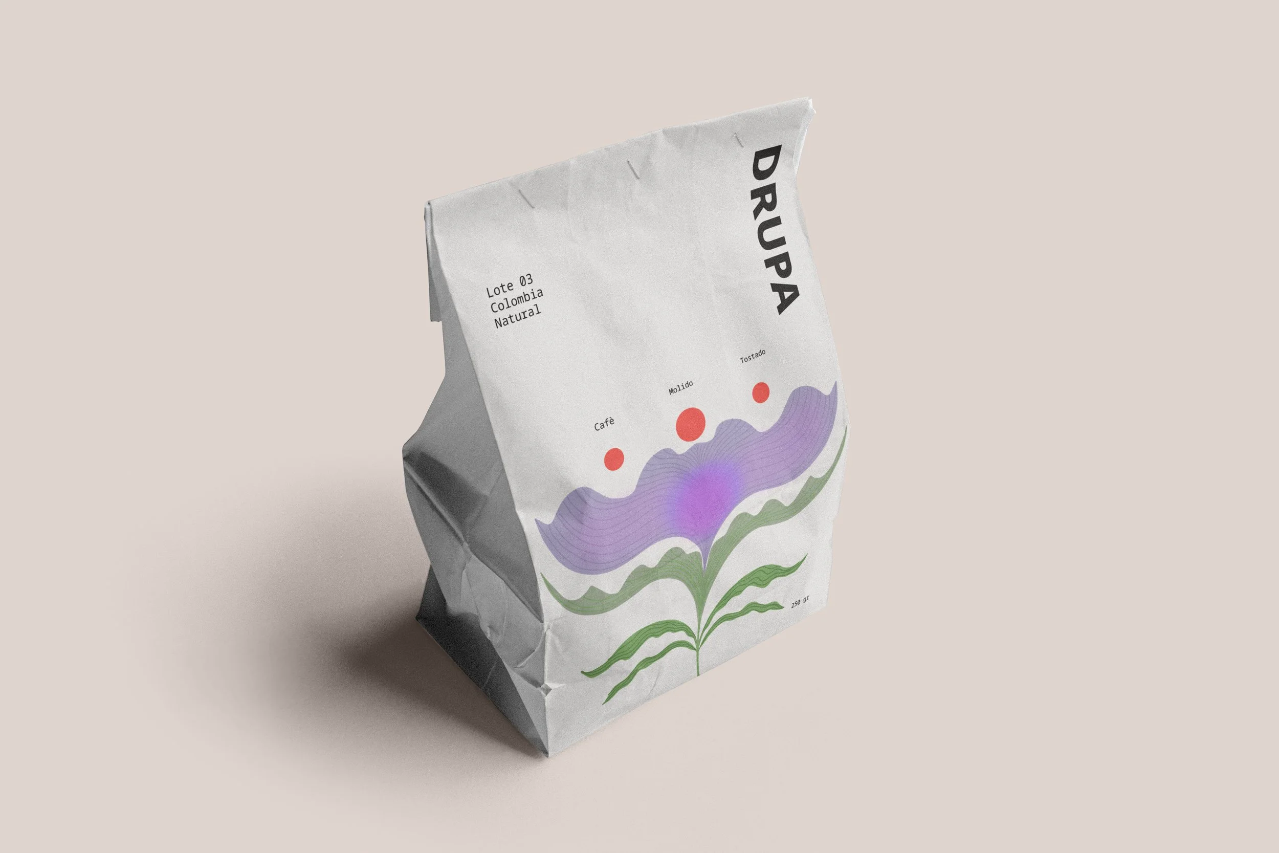
At the heart of this identity lies a custom illustration that merges the organic with the minimalist. It features a hand drawn botanical form, crowned by three red circles symbolizing the drupe: the coffee cherry at its peak of ripeness. This geometric interpretation of the fruit adds a layer of visual and spiritual balance, transforming a commercial logo into a piece of botanical art.